
Revamping task processing, approving task easier & faster
Designing one of the most used & one of the biggest source of income flow.
Help user to scan & review the information they need. So the approval process become easier & faster.
For more context, this flow is used by user to do approve/reject the transaction before the transaction is executed. In corporate banking, transaction are have some layer (maker = make transaction, approver = approve/reject transaction & releaser = release transaction)

Why we revamp this design & flow?
This flow is one of the main features in BNI’s corporate banking product. It was built in 2009 and has never been touched.
There are many problems here based on user complaints and interviews. If we can improve this flow, it means more user tasks are completed, more users are happy, and more users will want to use this product.
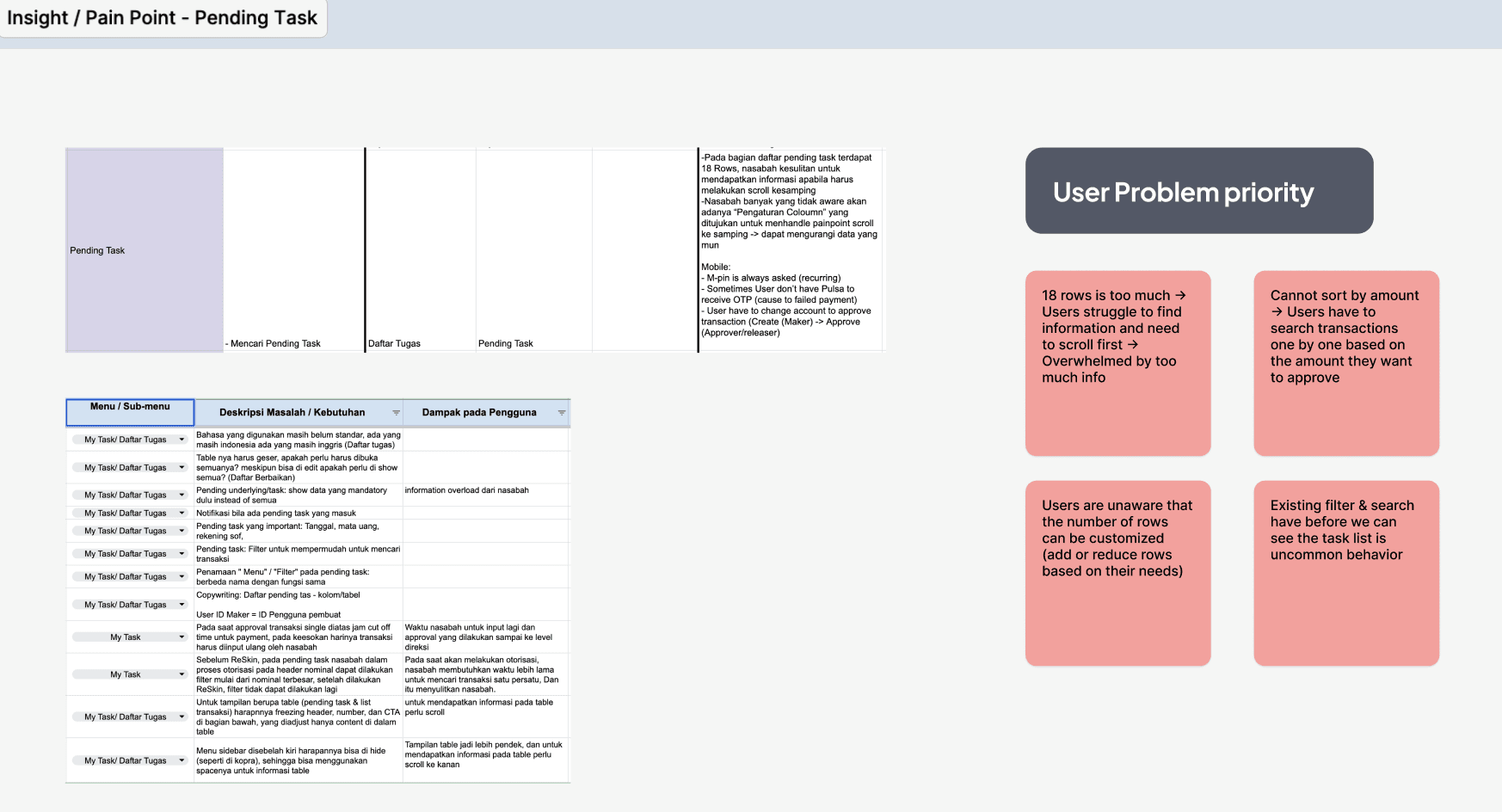
Insight Gathering
Based on the data we had, the problems that were frequently mentioned are: long steps to see the task, difficulty scanning important information for decision-making (overwhelmed), and CTA buttons being on the same level, which makes users confused (resulting in wrong clicks).
Looking at existing design & flow
Make users willing to complete their registration process & increase user registration conversion so that we can convert them to start doing transactions.
First page: Search the task
When user go to "Pending task" page, they need to fill a lot of information first so that the system can show the task.
This is make the user job harder because they need to fill all the information each time they open this page

Task List / search result
The result depends on what the user fills in on the first page. If the user doesn't fill in the information correctly, the result will be wrong.
Let’s say the search result is what they expected — the user still needs to read and look for the information they need in the table before approving or rejecting the task. It’s time-consuming. Even before doing their main job, they already have to do a lot of things first.

Working on the solution: Help user to make their job easier based on their behavior
Before jumping into desgin, I trying to understand how user use our product, how they approve/reject the task and trying to understand what kind of information they need to make their job/decision making faster.
Doing FGD to understand their pain point, needs and doing card sorting on what information they usually read
Here is the FGD result, user just need to know date created, feature, account & transaction amount in the task information before they can continue to approve/reject the task.

Crafting the Design solution
Here are some changes from the previous design:
• Removing the search the task flow: When user go to the pending task page, we will show all the task directly. Remove the search process in the beginning of the flow.
• Simplify Search & Filter: showing only most important action, hide other in the advance filter menu.
• Reduce information in the table: we reduce information from 18 information to just 6 important information based on what user said in the FGD.
• Merging some action & place the CTA into related place
• Made important action more prominent

Design comparison old vs new design

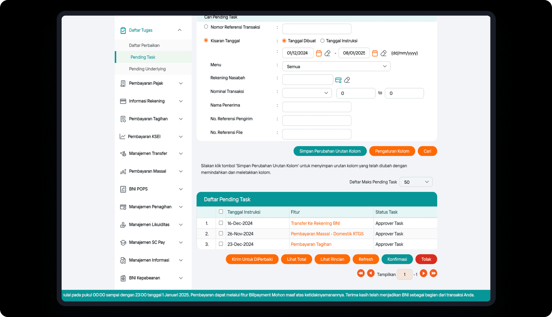
Old pending task design & flow
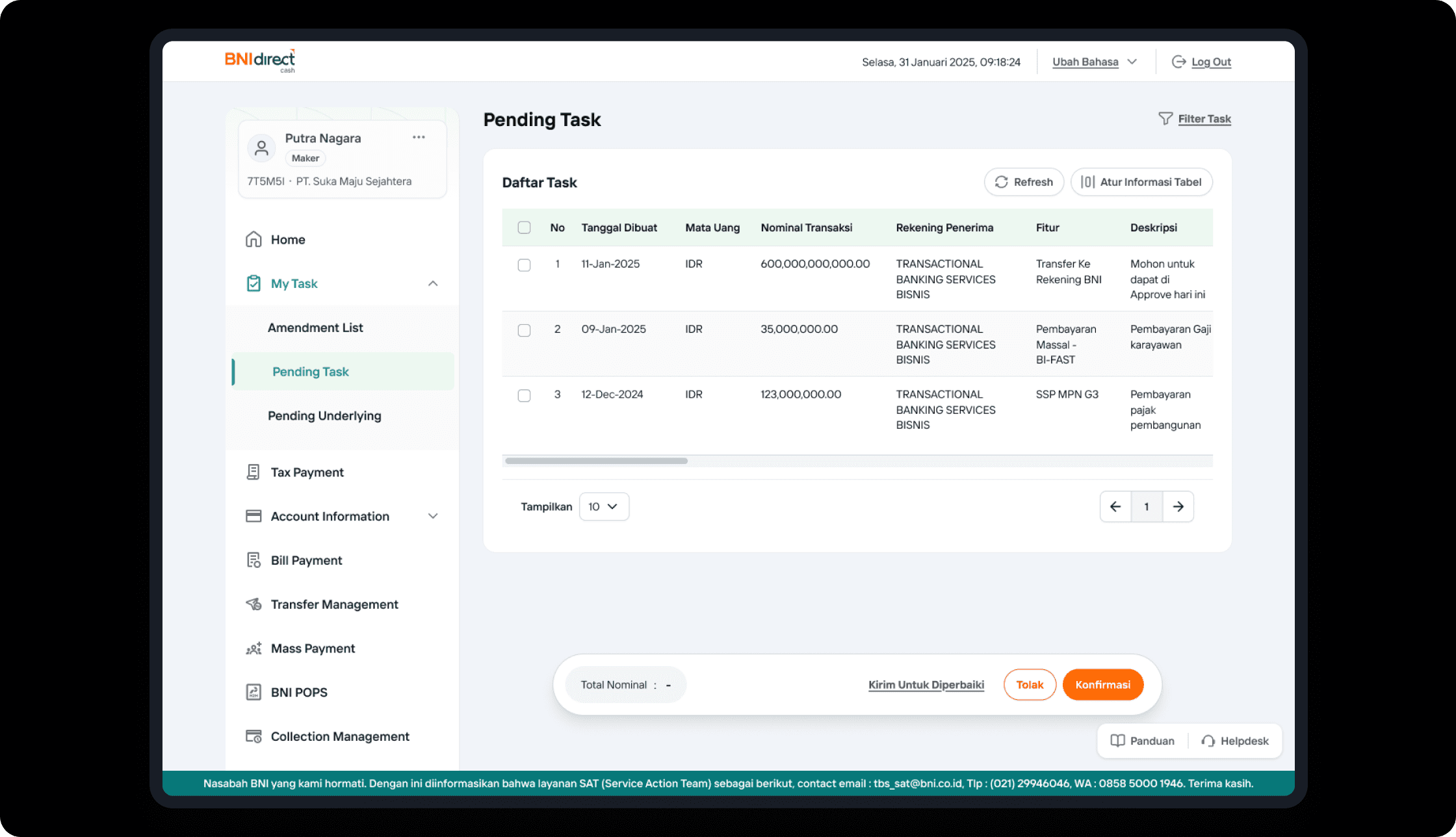
New registration design & flow
Project Impact
This project shown positive result after the implementation
Improved task scannability—helping users focus on key decision-making data (Nominal, Account, Description)
Faster decision-making process, leading to 80%+ reduction in average processing time (from 5 to 1 minutes)